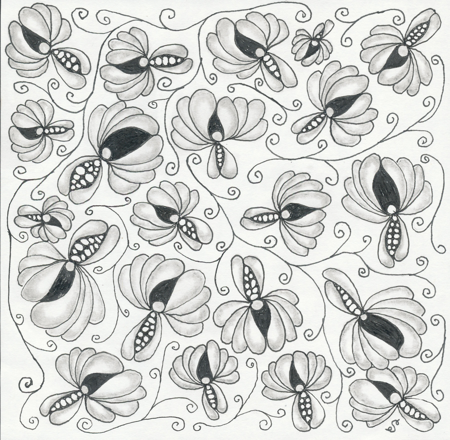
Organic and botanical tangles are a lot of fun to draw. One day I stumbled upon Kiss (by Olga Barko) in a YouTube video by Melinda Barlow, CZT. While I looked for step-outs, I was unable to find them illustrated on a sheet anywhere. However, the linked video demonstrates the steps for drawing Kiss.
As you can see below, I drew Kiss tangles every-which-way to cover the square. Then I added strands of Fescu to fill in the gaps and to tie the piece together. Lastly I added shading. In this case I used a larger square sheet by Strathmore (if I recall correctly), not a standard Fabriano tile.
After a fairly long absence from attending this website, I’m back and ready to blog again. Much has happened while I’ve been “away” (Covid-19, loss of job, life in general). Rest assured that I wasn’t idle when it comes to pursuing my passion for art, design, and photography during my absence!
Moving forward I will share some of the things that learned, and some of artwork that I worked on.
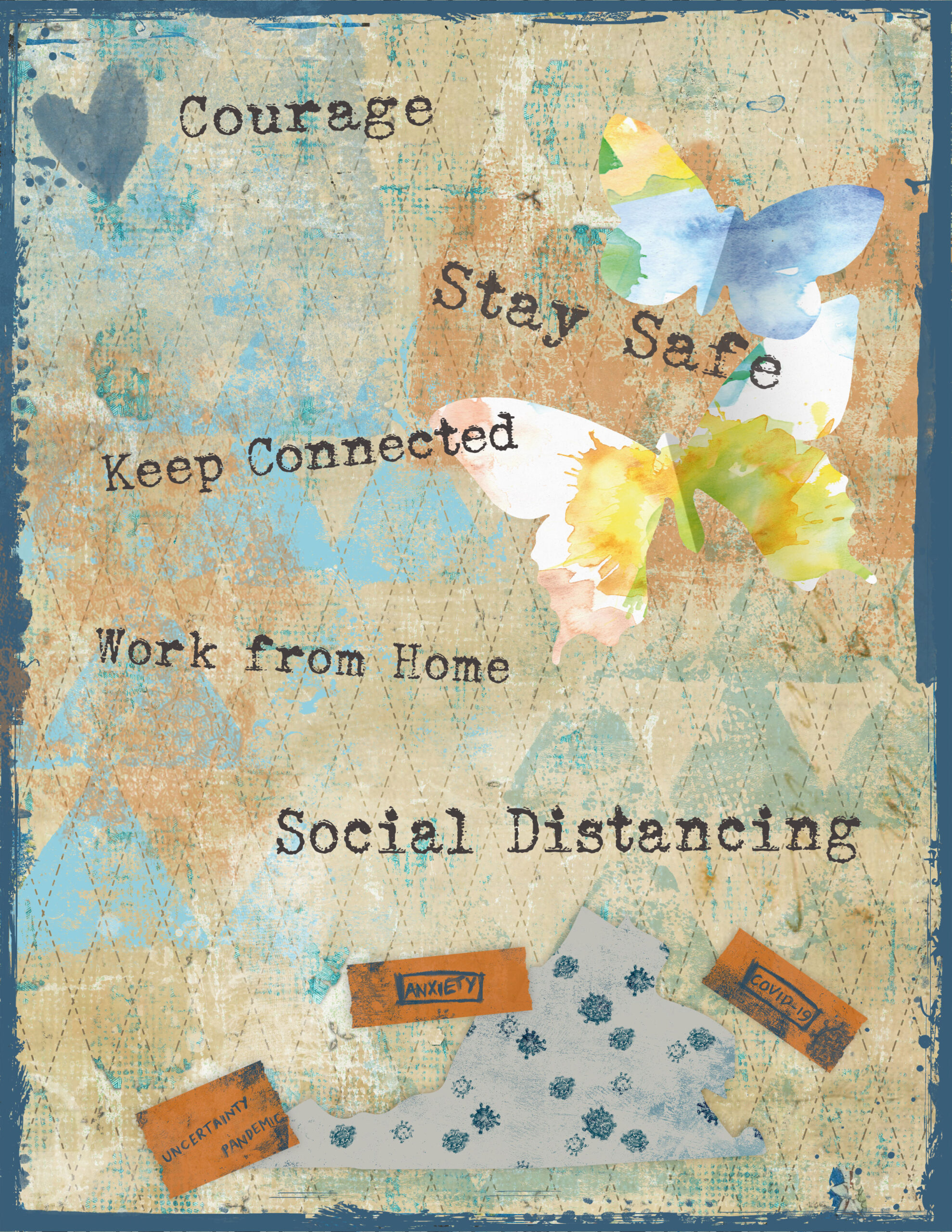
I’ll start with a digital art journal page that I created during the Covid shutdown in early 2020.
Art Journal – Covid page
For this page I used various resources from Tangie Baxter & Co. (background, edge) and DigitalScrapBook.com (stamps, washi tape, map, other elements). The font is Sears Tower. It was helpful to engage in some relevant art therapy at the time.
Here was a wonderful opportunity to combine various things that I love: Watercolors, Coffee, and Croissants!
My mother often spoke to me and my sister about how she started drinking hot coffee at age six. She grew up in Georgia. Call it fate, kismet, or whatever you like, but she introduced me to the enticing taste of coffee at a pretty early age. In my case, it was “coffee milk” (cooled coffee with milk and sugar), and also coffee ice cream. Any way you look at it the dye was cast. To this day I absolutely adore my coffee.
Given my coffee enthusiasm – plus my love of visual art – it was only a matter of time before I would want to find ways of combining these two things. And, of course, watercolor seemed a great medium to pursue!
As luck would have it I found two relevant classes offered at Skillshare:
Fun and Easy Watercolors: Draw a Beautiful Coffee Illustration by
Mariya Popandopulo
Fun and Easy Watercolors: Drawing Cookies and Pastry by
Mariya Popandopulo
These classes were very helpful and quite enjoyable, and I recommend them both. But I should point out that there is no shortage of other great classes and tutorials available out there on how to paint with watercolors. Check out other classes and video tutorials at Skillshare.com, Lynda.com, YouTube, etc.
MATERIALS USED:
PAPER
Canson Watercolor Cold Press Paper (140 lb, 11 x 15″ )
WATERCOLOR PAINTS (a variety of Browns, Reds, and Yellows)
Winsor & Newton Cotman Watercolors:
Raw Sienna
Cadmium Orange
Burnt Sienna
Burnt Umber
Pentel Watercolors:
Ultramarine
Yellow Ochre
Reeves Watercolors:
Deep Yellow
Red Ochre
INK
Sakura Pigma Micron Pen (01) in Black (for the bubbles)
A practice exercise in the first class involved exploring different watercolor techniques to illustrate different looks for coffee. The image below shows my results:
Coffee Illustrations Using 6 Different Watercolor Techniques
The techniques which were used in the exploration excercise included variations on wet on wet, wet on dry, single color, and incorporating multiple colors. The bubbles were done in black pigma micron ink. The shading was achieved by using mixing colors to create a blue-gray.
In addition to painting likenesses of cups of coffee, I also practiced painting croissants. Fortunately these pastries are fairly easy to draw, and the coloring was achieved by glazing different colors over one another.
Here is my final result.
Watercolor Coffee and Croissant
All in all I am very happy with how my painting turned out. Looking forward to creating other similar works in the future!
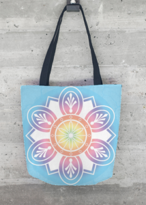
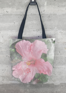
Not long ago VIDA added tote bags to their product line. I’d been wanting to upload some of my designs to be featured on totes for a while and finally got around to it!
The first one (below) is a variation on a mandala that I created in Photoshop CC. I described the project in this post on my blog. For this variation I applied a different gradient and texture.
Textured Mandala Tote
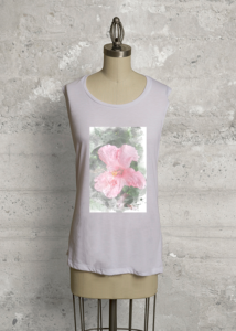
The second one (below) is a reuse of my first design for VIDA, an applied watercolor effect to a photo of a hibiscus flower that I took at Walt Disney World a couple of years ago. I continue to love the watercolor texture effect as applied to photographs!
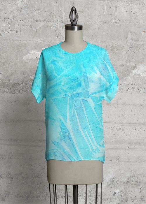
The newest addition to my VIDA collection is called Aqua Bold. It is a Modern Tee splashed with shades of aqua and a touch of purple. I like how the design covers the entire front of the top, including the sleeves.
The original artwork is a watercolor color wash (which you can view on the item page at VIDA). Colors used were green, blue, aqua, and purple. After the paints were applied I textured the piece using scrunched up plastic wrap and allowed it to dry. It created an interesting shard-like or crystalline design in the paint.
Please visit VIDA and take a look at my small but growing collection!
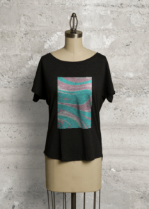
It is with pleasure that I can announce my second design for VIDA (pictured above). This design is featured on a black Boatneck Boyfriend Tee with dolman sleeves.
I am so pleased to announce that I have become a VIDA designer! They found my artwork online and contacted me to inquire if I would be interested in collaborating with them. VIDA is a Google Ventures company which connects designers with apparel makers all over the world. Read more about VIDA and their story here.
As I’ve mentioned elsewhere on the blog, this has been a time in my life when I have been cultivating my interest in creating visual art in various forms – from photography to digital art to drawing. Of course the idea of having my art incorporated into apparel and accessories is very exciting!
Yesterday VIDA accepted my first design and launched my collection. It is called Hibiscus Bloom, and it is based on one of my photos from Florida last year. The design is featured on a white Sleeveless Knit Top. I love adding texture to photographs, and in this one I used a technique with Photoshop brushes to create a watercolor effect.
Not long ago I was looking at some of my favorite artistic sites for inspiration. I came across examples of a technique which creates an effect on a photograph that makes it look like it is partly a drawing (or illustration or sketch). This technique seems to be popular for use in digital scrapbook and art journal layouts, however it could also be used for other purposes like creating lovely fine art prints to hang on your wall. While colorful travel photos work great with this technique, portraits or other types of photos could be used as well.
We use cookies on our website to give you the most relevant experience by remembering your preferences and repeat visits. By clicking “Accept”, you consent to the use of ALL the cookies.
This website uses cookies to improve your experience while you navigate through the website. Out of these, the cookies that are categorized as necessary are stored on your browser as they are essential for the working of basic functionalities of the website. We also use third-party cookies that help us analyze and understand how you use this website. These cookies will be stored in your browser only with your consent. You also have the option to opt-out of these cookies. But opting out of some of these cookies may affect your browsing experience.
Necessary cookies are absolutely essential for the website to function properly. These cookies ensure basic functionalities and security features of the website, anonymously.
Cookie
Duration
Description
cookielawinfo-checkbox-analytics
11 months
This cookie is set by GDPR Cookie Consent plugin. The cookie is used to store the user consent for the cookies in the category "Analytics".
cookielawinfo-checkbox-functional
11 months
The cookie is set by GDPR cookie consent to record the user consent for the cookies in the category "Functional".
cookielawinfo-checkbox-necessary
11 months
This cookie is set by GDPR Cookie Consent plugin. The cookies is used to store the user consent for the cookies in the category "Necessary".
cookielawinfo-checkbox-others
11 months
This cookie is set by GDPR Cookie Consent plugin. The cookie is used to store the user consent for the cookies in the category "Other.
cookielawinfo-checkbox-performance
11 months
This cookie is set by GDPR Cookie Consent plugin. The cookie is used to store the user consent for the cookies in the category "Performance".
viewed_cookie_policy
11 months
The cookie is set by the GDPR Cookie Consent plugin and is used to store whether or not user has consented to the use of cookies. It does not store any personal data.
Functional cookies help to perform certain functionalities like sharing the content of the website on social media platforms, collect feedbacks, and other third-party features.
Performance cookies are used to understand and analyze the key performance indexes of the website which helps in delivering a better user experience for the visitors.
Analytical cookies are used to understand how visitors interact with the website. These cookies help provide information on metrics the number of visitors, bounce rate, traffic source, etc.
Advertisement cookies are used to provide visitors with relevant ads and marketing campaigns. These cookies track visitors across websites and collect information to provide customized ads.