Category Archives: Textures

Adding Texture to Photography

Credit: Chris Barbalis (Unsplash)

It’s hard to believe that it’s been so long since I last posted, but I’m back with this post about adding texture to photographs. The idea of adding texture to photographs has been an interest of mine for years. Over time I’ve taken several online classes both on how to make and on how to apply textures.

One of these classes was offered by Kim Klassen and I thoroughly enjoyed the class! Kim is a very talented photographer and artist. Happily, Kim is back with Texture Tuesday 2.0 this week. In her post she introduces a set of lovely mono grunge textures, and also a set of light and shadow overlays for download. In addition, she shares three videos with instructions on how to use the textures and the overlays. I urge everyone who is interested in textures to visit her website and download these assets!

Of course I wanted to experiment and play with the new textures. I opened up a still life photo from Unsplash to work with in Adobe Photoshop Creative Cloud. The process that I followed is described below.

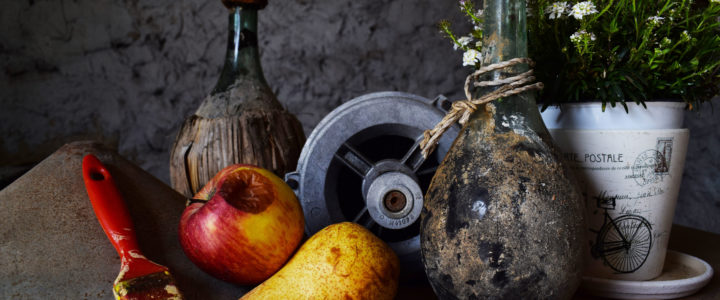
Here is the unedited photo:

Credit: Chris Barbalis (Unsplash)

As you can see, the image is rather dark but shows a fair amount of texture already. I decided to apply the 5.together texture from the collection and set the blend mode to Overlay. Also I lowered the opacity of the layer to 85%. Then I added a layer mask and painted over the white flower pot (on the right) so that it wasn’t too bright and distracting.

Photo with added texture

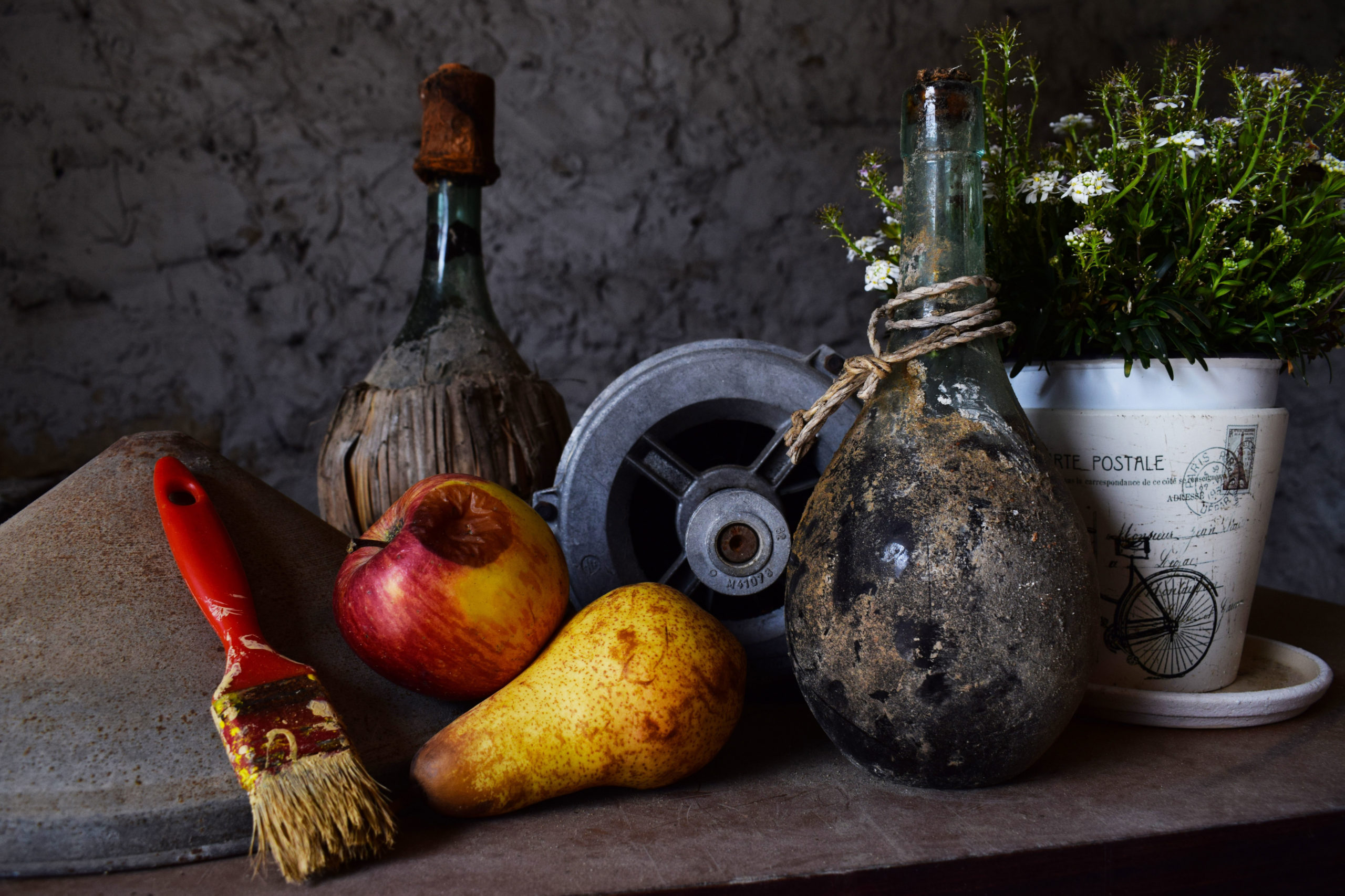
The effects of the applied texture are subtle, but the result is to brighten the objects in the photo and to bring out and enhance the various textures in the image.

It was a lot of fun to do and I look forward to playing more with the other textures!

Straight Lines and Other Things

Diva Challenge #368 is to draw a tile with straight lines only. Cool idea! For my tile I decided to focus on Frost Flower by Karry Huen. Stepouts are available here.

As my string I drew five squares, with one on top of the others in the center.  Then I filled each of the squares with Frost Flower and added shading. The result is straight lines going every which way! There isn’t a single curvy line in this tile.

Straight Lines
Frost Flower

It’s been a busy several days in tangling. This week Adele Bruno is celebrating her It’s A String Thing challenge’s 5th Birthday! To mark the occasion I submitted the following tile:

IAST Happy 5th Birthday
Knightsbridge, Kitl, O, Prestwood

My intention was to add color to this tile. Things didn’t work out according to my vision though. The watercolors caused some of the ink to run, and the gel pens I used were simply too dark. Anyway, luckily I scanned the tile before applying watercolors and was able to send in the black and white version.

One more tile to share in this post. I love rose patterns and had seen Helen Williams’ video on how to draw her pattern Spiral Rose. So of course I wanted to try it out.

Spiral Rose
Spiral Rose

I will add color later, but I do think it is very striking in black and white!


Diva Challenge #314 – Scallamp

This week’s Diva Challenge #314 is another Use My Tangle (UMT) challenge. For this one we are asked to create a tile using Scallamp by Sarah Uram, CZT. A step out is available here on Sarah’s blog Zen and Zin.

Scallamp reminds me of shallots for some reason. Anyway, I had a little trouble with this new tangle. The main problem was in keeping the wavy parts reasonably symmetrical. I also think the ends are too wide on the central tangle. The lines should be closer together, and I didn’t do the c-curves correctly. But overall I think my first attempt at Scallamp looks pretty good. I will have to practice, practice, practice! Thanks to the Diva for another good challenge. Continue reading

Arts Classes Galore

Sorry to say that I’ve been absent here on my blog for the past couple of months. Following the completion of the Mandala Magic workshop (see previous posts), and also a busy holiday season, I found myself signing up for a Premium membership on Skillshare.com (referral link at the end of this post). Suffice it to say that I went a little wild taking a bunch of different design related courses! I’m very glad that I did, and I’ve learned a great deal.

For each class that you take on Skillshare you are invited to complete a project to demonstrate the new skills that you’ve learned as a result of taking the class. I’d like to share some of my projects here. There are more in process and I will add them to this post later on. Continue reading

Wearable Art

Vida: Hibiscus Bloom

I am so pleased to announce that I have become a VIDA designer! They found my artwork online and contacted me to inquire if I would be interested in collaborating with them. VIDA is a Google Ventures company which connects designers with apparel makers all over the world. Read more about VIDA and their story here.

As I’ve mentioned elsewhere on the blog, this has been a time in my life when I have been cultivating my interest in creating visual art in various forms – from photography to digital art to drawing. Of course the idea of having my art incorporated into apparel and accessories is very exciting!

Yesterday VIDA accepted my first design and launched my collection. It is called Hibiscus Bloom, and it is based on one of my photos from Florida last year. The design is featured on a white Sleeveless Knit Top. I love adding texture to photographs, and in this one I used a technique with Photoshop brushes to create a watercolor effect.

Here is a link to my collection page at VIDA.

Please take a look!

Sketch and Watercolor Effect on a Photo

Not long ago I was looking at some of my favorite artistic sites for inspiration. I came across examples of  a technique which creates an effect on a photograph that makes it look like it is partly a drawing (or illustration or sketch). This technique seems to be popular for use in digital scrapbook and art journal layouts, however it could also be used for other purposes like creating lovely fine art prints to hang on your wall. While colorful travel photos work great with this technique, portraits or other types of photos could be used as well.

Continue reading

Textured Vintage Image

I love to collect vintage images for use in my digital artwork. Today I want to show you this pretty vintage teacup image (get it here from the Graphics Fairy) which I modified by adding a texture and other embellishments (resource links below).

The original vintage image has a white background which seemed too plain. So I decided to add a texture. In this case I chose a free texture by Kim Klassen. Visit her blog here to view her lovely textures, both free and paid. You can sign up for her email list and receive updates, information about classes, tutorials, and more.

Continue reading